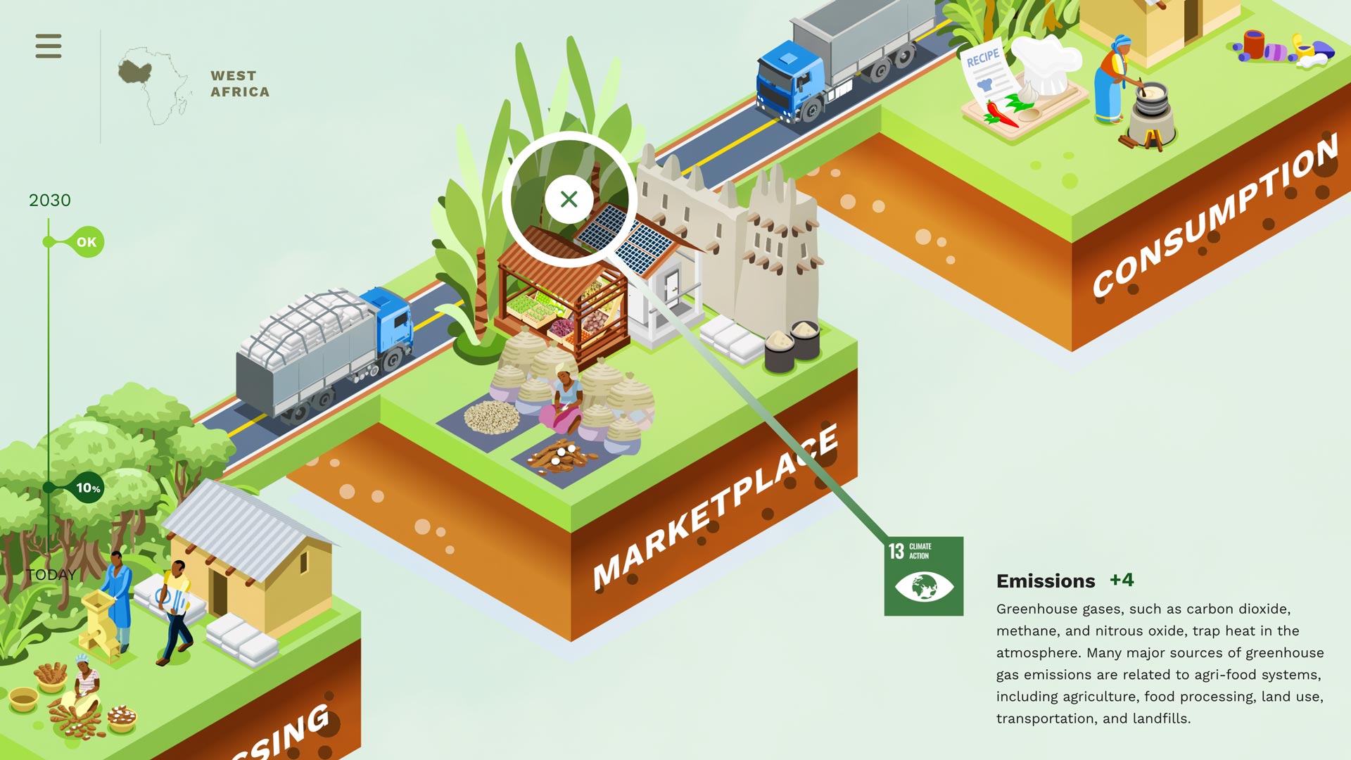
Food Clarity Framework

The Foodicons Challenge

For an iconographic system this large, the only solution is to crowdsource it globally.

The Foodicons Challenge will be designed so that designers from all over the world can download clear templates and specifications, sign-up to design icons for specific food terms, and submit contributions (in multiple drafts) of finalized icons to be included in the Foodicons Collection. Submissions will be vetted (and chosen or awarded?) by a design council of expert designers and also by a panel of food experts. Our hope is that the resulting icons work well visually and communicate concepts clearly.

With the large breadth of terms in the challenge – from simple and ubiquitous terms like “Fish,” to complex and often abstract processes, like “No-Till Farming” – it’s not realistic to expect that every symbol will be immediately understandable by every stakeholder throughout food supply cycles. It’s also likely that consumers will have not have knowledge of all of these terms, as most are either specific to industrial and commercial food systems or are too new to have widespread understanding. For this reason, we’re focusing, first, on creating icons for commercial and industrial stakeholders. However, any good iconographic system should be easily learnable, allowing various users to learn, remember, and identify symbols over time.

Consider, for example, the now ubiquitous symbol for Recycling (the three arrows forming a closed cycle).The graphic of one arrow pointing to the next doesn’t immediately communicate the concept of recycling waste, and when it was first introduced, few knew what this icon represented. Over time, it has become one of the most understood symbols internationally. This is what a clear, learnable symbol can achieve and this is the aim of this challenge.

A family of icons wouldn’t be much use if it weren’t freely available for anyone at any point in food systems to use.  That’s why we are making this an open-source collection. While we plan to credit designers for their work, all submissions will be made with the understanding that no royalties or intellectual property will prevent free use. All work will be submitted and labeled with Creative Commons access and be made available in multiple popular file formats.

All Foodicons must be designed so that they communicate effectively in monochrome (black and white) to ensure that they can be used in a wide variety of applications. Icons may have several other variations as well, such as grayscale, color, and even animations.

Design specifications and final icons will be hosted on an easily accessible website, making them widely available to those who want to use them.

The Challenge Process

Each Foodicons challenge will include a set of food terms and definitions with design specifications and instructions, and a timeline for completion. The timeline will allow for 2 drafts of icon designs with critique and feedback from the design council and food expert panel. Together, these two groups will advise designers on how well their ideas and designs are communicating the terms and answer any questions that may arise in the design process around communicating subtle or abstract concepts.

AGRICULTURAL LABOR
Keston Hinds Cruz

FOOD SCIENCE LABOR
Keston Hinds Cruz

ROBOTIC LABOR
Keston Hinds Cruz

For example, in our prototypes, devising an icon to represent “Labor” quickly became more complex as issues arose around how to communicate different types of labor. In reviewing the first draft of this icon, food systems experts and icon designers realized that there are several kinds of labor that might need differentiating, some only now emerging (like automated or robotic labor). Clearly, one icon may not be enough to communicate all kinds of labor, but three different ones might. The Food Clarity Activator has already identified over 1000 potential food terms that could fuel several rounds of challenges, depending on popularity and participation, and this already long list may grow in the process of identifying the meaning and uses for any one term or icon.

The prototyping process has taught us several other important lessons. For example, these icons use a visual vocabulary of reusable elements that can and should be used consistently. A simple symbol for signifying a generic plant could be used within more complex icons for Agriculture, Supply Cycles, Crops, and Farms. In this way, one element, reused where appropriate, not only unifies the system as a family, but makes learning new icons much easier. This is especially true of the more abstract icons.

Context, too, matters. Consumers are familiar with fewer food processes and systems and sometimes have a more limited experience or understanding of the commercial and industrial aspects of food. The same elements may communicate differently across groups and this may require the same concepts to be represented differently to different stakeholders.

Details also matter. An icon for “Fish,” if it’s representative at all, needs to represent a fish that people eat. A food process or location, like a barn, needs to be both accurate and recognizable. Consumers may be unfamiliar with industrial processes and objects while still needing to understand an icon that represents an issue important to them, such as “Line-Caught Fishing.”

To be truly useful, this system will need to transcend cultures, communicate clearly to a wide variety of people, be usable in a variety of applications, and be accessible to people with different needs, understandings, and abilities. This all sounds like a tall order, but our prototyping has shown us that it’s possible.

Foodicons Specifications

Before starting the prototype, we devised a simple set of design specifications to differentiate this family of icons from others and to allow variation and room to explore. We chose a hexagonal icon shape because it’s more distinct than more common squares and circles, and we stood it on a point (rather than a side) to create a more energetic visual appearance. In addition, we suggested to our prototype designers that more three-dimensional objects might communicate more effectively to a wider range of people. We also defined a 60° light source to help describe these objects in form, where applicable.

In this process of creating specifications we were inspired by the iconographic systems developed by Michael Renner and Joachim Muller-Lancé who designed multiple, extensive sets of icons for the Pacifica Bell SMART Yellow Pages in the 1980s. The icons they created are wonderful examples of clear communication that has originality and character. Their designs were sometimes charming, sophisticated, and surprising, while always being clear (at least, in context), just as we hope the Foodicons to be. The work of Renner and Muller-Lancé has seldom been seen since this time and, sadly, isn’t archived or cataloged anywhere.

Food systems are in need of symbols for communication. Many food systems and frameworks trying to communicate their complexity are at the mercy of language and need clear symbols and icons. This is just one example of what is already a need for many food professionals.


Foodicons Prototypes

The first prototypes for these icons were created by graphic design students at California College of the Arts in San Francisco (CCA). The TBD class is comprised of college juniors and seniors working on special projects for real business applications. The instructor, Eric Heiman, and project liaison, Tracy Tanner, worked with the Food Clarity Framework to specify and explore this first set of icons. Each student chose two terms, some extremely new and abstract to them, and explored their communication in three rounds of drafts. Drafts were critiqued by the Food Clarity Framework food experts as well as the design experts at CCA. The results sometimes resulted in a proliferation of icons where there was only one term before (as in the example above of Labor).

Here are the results of this prototyping round of icons.

NET-CAUGHT FISH
Keston Hinds Cruz

LINE-CAUGHT FISH
Keston Hinds Cruz

AGRICULTURAL LABOR
Keston Hinds Cruz

FOOD SCIENCE LABOR
Keston Hinds Cruz

ROBOTIC LABOR
Keston Hinds Cruz

FOOD WASTE
Jennifer Lam

COMPOSTING
Jennifer Lam

NO-TILL FARMING
Jennifer Lam

SUPPLY CYCLE
Alice Niu

LIVESTOCK
Alice Niu

LOCATION
Karina Kristensen

PESTICIDES
Karina Kristensen

BEEF
Ileana Garay

CLIMATE SMART AGRICULTURE
Ileana Garay

AGRICULTURE
Momo Gao

WATER
Momo Gao